 Detailed maps show worldwide land degradation, including the deforestation that is now forcing migrants to leave Guatemala and Honduras
A new map developed at the University of Cincinnati illustrates one motivating force behind migrant caravans leaving Guatemala and Honduras to reach the United States.
UC geography professor Tomasz Stepinski created the new world map showing dramatic changes in land use over the last quarter century. Stepinski has turned high-resolution satellite images from the European Space Agency into one of the most detailed looks so far at how people are reshaping the planet.
“Right now there are caravans of people walking to the United States. Many of them are coming from Guatemala,” Stepinski said.
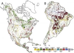
News agencies such as The Guardian have called some of the Central American migrants “climate-change refugees” since many are fleeing successive years of crop failure. Stepinski says climate change tells only part of the story. His map shows how Guatemala has seen widespread deforestation. “They’ve lost the forest because people use wood for fuel. It’s one part of the refugee crisis.”

A portion of new world map shows changing landscapes in North and South America. White indicates little or no change. Darker shades indicate the highest rate of change in each category. Click for large image
The map illustrates how 22 percent of the Earth’s habitable surface has been altered in measurable ways, primarily from forest to agriculture, between 1992 and 2015.
The map tells a new story everywhere you look, from wetlands losses in the American Southeast to the devastation of the Aral Sea to deforestation in the tropics and temperate rain forests.
“Of course, it raises alarm bells. But they’re not new ones,” Stepinski says. “We already knew about deforestation or wetland loss or increasing urbanization. But now we can see exactly where all of that is happening.”
The European Space Agency in 1992 began capturing satellite images of the Earth to study climate change. Surface cover can dramatically influence temperature depending on whether it absorbs or reflects sunlight. Likewise, forest cover absorbs more carbon dioxide than shopping centers.
“The great achievement for the European Space Agency was to make sure the satellite images were compatible from year to year so you could compare them,” Stepinski says. The map shows how finite natural resources are being exploited on a global scale. “What makes this so depressing is that it’s examining a timescale that is shorter than our lifetime.”
One of the most obvious examples of changing land use is found around cities, says the study’s lead author and former UC postdoctoral fellow Jakub Nowosad, now an assistant professor at Adam Mickiewicz University in Poland.. “The direct impact of human actions is reflected in the patterns of urbanization. For example, you can see suburbanization and cities densification in North America and Europe.”
UC geography researcher Pawel Netzel, who also contributed to the project, says western China has seen vast urbanization while India’s most obvious development has been in its smaller cities. “I hope this map will make people more aware of the human impact on our planet. As a society, we need to be better informed of the scale of changes we make to the Earth, and in my opinion, this awareness can influence future changes in environmental policies.”
The satellite images are so detailed, UC geographers could organize them into 300-square-meter grids called pixels. Each pixel identified changes among 22 land-use categories describing various types of farmland, forest, wetlands, grasslands or urban development. But the tiny pixel sizes and large numbers of variables made a global analysis virtually impossible. In this incarnation, the map looked like a bowl of Fruity Pebbles.
So Stepinski organized the pixels into larger 9-kilometer squares and narrowed the number of land uses to nine types reflecting broader descriptions such as agriculture, forest or development. In comparing differences between the 1992 and 2015 maps, he used three shades of color to identify the extent of change from one land use to another.
Soon the story of the past 25 years began to take shape. The map shows that the Sahara Desert in North Africa is growing. “This is the transition area called the Sahel. And if you notice, you see grassland losses because of climate change — more desertification,” Stepinski says.
The map of the United States shows huge losses of wetlands in the Southeast along with growing urbanization outside cities.
The map illustrates the dramatic disappearance of the Aral Sea, which dried up in the 1990s after farmers in Kazakhstan and Uzbekistan diverted its tributaries for cotton fields.
Stepinski calls it “a total disaster. “This was a big saltwater lake fed by two rivers. They diverted water for cotton and the sea dried up into grassland. Today, you see huge boats sitting in the middle of fields.”
While the map tells the story of development in broad strokes, researchers can examine any portion of it in fine detail. The map presents data from each 300-square-meter pixel. The project was published in the International Journal of Applied Earth Observation and Geoinformation.
Adapted from materials provided by the University of Cincinnati.


