


If someone tries to tell you that the Marxist concept of the universal metabolism of nature is “just a metaphor,” show them this map, prepared by World Mapper in collaboration with Yadvinder Malhi of the University of Oxford.
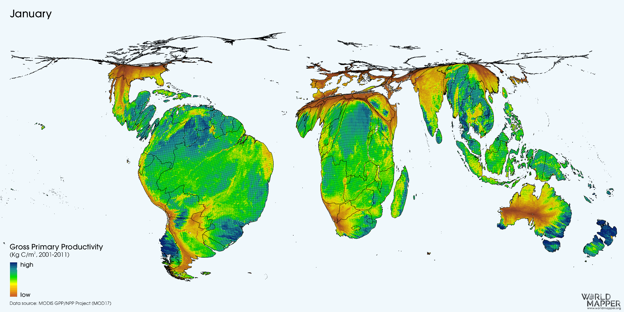
The map displays the the cumulative composite Gross Primary Production (GPP) of the biosphere on land. This productivity is nature’s “fuel for life” as it gives us an idea of how the biosphere is utilizing the sun’s energy to support its organisms, turning plants into the biomass factories that support life higher up the food chain.
When and where nature ecosystems are most productive depends a lot on the time of the year. The animation of productivity shows how the changing seasons determine the variability of energy production throughout the year. Distribution of landmasses lead to the tropics being over-proportionally present in this image, especially in the northern hemisphere’s winter.
The map show land surface resized according to its annual gross primary production (GPP). Each grid cell is proportional to the total (annual or monthly) production in that area which is also indicated through the colors that are overlaid.
View more details in the Worldmapper map library: Terrestrial Ecosystem Productivity.